Again, I am a tiny bit creative with the number of objects. I brought object 4b with me. 4c is part of the Nysted Heier collection, but I left it in my office. 4a is new to me; I first looked it over while preparing this post.
Another note: I write these blog posts relatively fast, mainly to catch my thoughts on digital paper. To overcome perfectionism and other bad habits, I publish posts unrefined once they are finished (they have a beginning, a middle, and an end—and pictures). Only after the first publication will I go through the post again, fix all the typos and odd sentences, and play around with the layout and arrangement of images. In a way, my blog posts are drafts for a future publication, but I would rather have them out than hide them in my notes. The pressure of having stuff out helps me write – at all. So, I ask you, dear reader, to cut me some slack. If the typos are too off-putting, I kindly suggest coming back in a day or two.
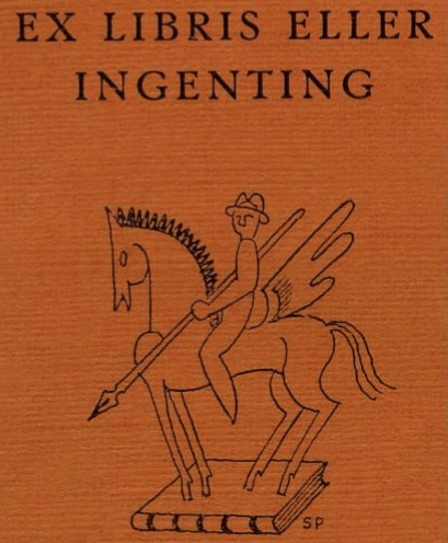
Why not – an exlibris?
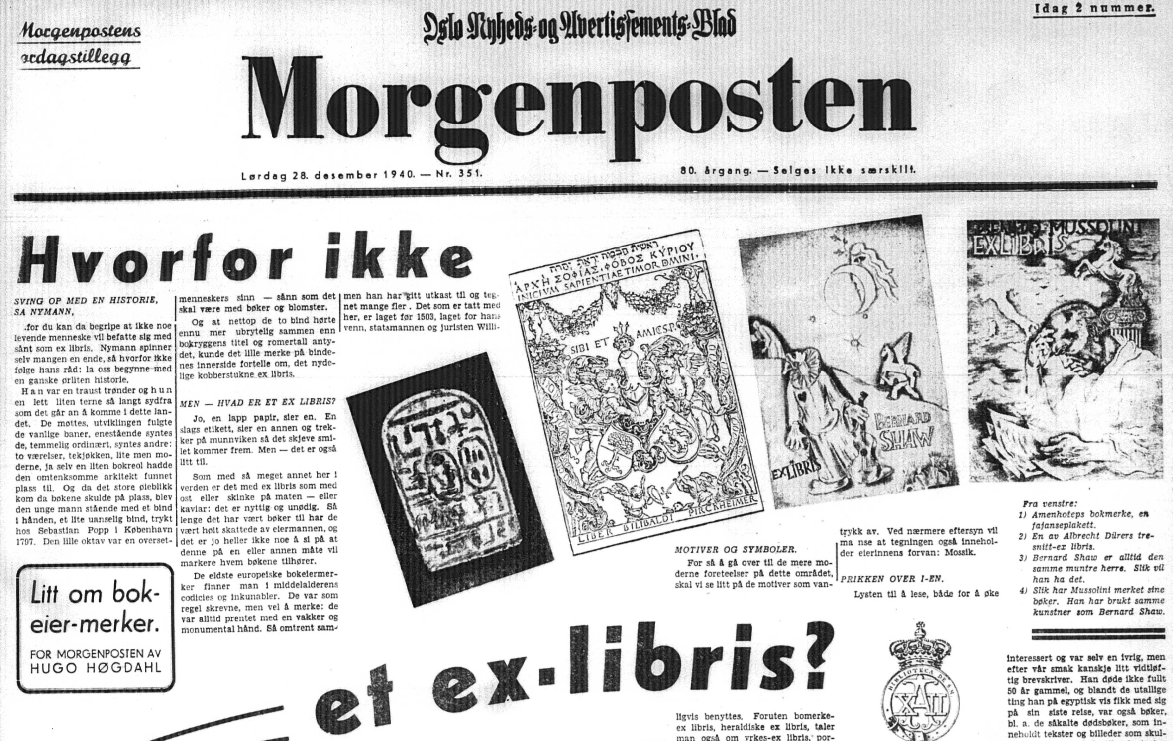
Object 4a
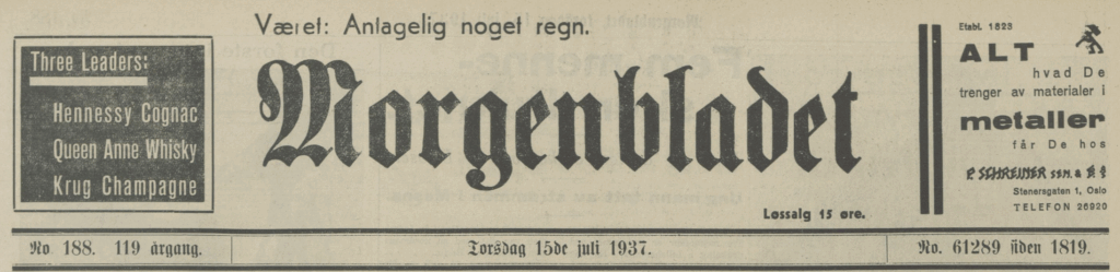
The opening page of the Saturday supplement of Morgenposten from December 28th 1940. This issue of Morgenposten’s Saturday supplement hasn’t been digitised by the Norwegian National Library yet, but is available on microfilm. I got a black-and-white digital copy of the microfilm via email after an enquiry sent to the public service at the Norwegian National Library on November 12th 2025.
This issue of Morgenposten hasn’t yet been digitised by the Norwegian National Library, but is available on microfilm.
Source: The Norwegian National Library. Microfilm-archive.
The “lørdagstillegg” – the Saturday supplement of the newspaper, opens on page one with the typographically bold and richly illustrated article by Hugo Høgdahl.
The article’s actual title is placed humbly in the middle-left of the page, in a square with rounded borders. It reads “Litt om bokeiermerker” [“A bit about bookplates”] by Hugo Høgdahl for Morgenposten (indicating an exclusive piece for this particular newspaper). Highlighted with large, bold type, however, are the article’s first two words, “Hvorfor ikke” [“why not”], which start the text, and the slightly curved typeset keywords “et ex libris?” [“an ex libris?”] following a curved double line in the middle-centre of the page. – In the top half of the text, four exlibris are reproduced; in the bottom, below the curved keywords, another four exlibris are placed in a slightly upwards slanted row; in the bottom half, a final row of five slightly upwards slanted exlibris is reproduced. Another three smaller-scale reproductions of King Alfons XII’s Supraexlibris, Jacob Brinchmann’s fingerprint exlibris and C.W. Rubenson’s cat-shaped exlibris stamp are placed throughout the article. One could say, the page showcases the exlibris “in full swing”.
However, the full-page article abruptly ends mid-sentence on the bottom-right corner: “Hvis man ikke selv er en høiviktig person, bør formatet på et ex” [If one isn’t an important person, the format of the ex… ought to be…”]. I could not find the rest of the article in the eight pages of the Saturday supplement that I got from the National Library. The 1941 special print of Høgdahl’s text, using the same typeset as the Morgenposten newspaper article, continues the sentence on page 21 as follows: “libris holdes innenfor en beskjeden ramme.” [“…libris held within a humble size.”]
Another paragraph of the original article seems to be missing, the part about Alfons XII’s super-exlibris. Høgdahl writes (cited from the same 1941 special print, page 26):
Alfons XII’s super-ex libris. Dette forekommer også i stålstikk-trykk på et lett chamoisfarvet papir, og hører som sådant til kategorien monogram-ex libris, som særlig en tid i Danmark var meget eftertraktet, takket være arkitekt Bindesbøl. Sammen med en venn åpnet han i København en broderi-forretning–populært kalt ‘Boden’–og herfra sendte han også ut sin krakteristiske monogram-ex libris. Som regel er denne form ikke tilrådelig, da et bokeiermerke bør inneholde eierens fulle navn.
[Alfons XII’s supra exlibris. This also exists as a steel-plate engraving on slightly chamoise-coloured paper and belongs to the category of monogram ex exlibris, which, especially during a time in Denmark, were in high demand thanks to architect Bindesbøl. Together with a friend, he opened an embroidery firm, colloquially called “the shed,” and sent his characteristic monogram exlibris from there as well. As a rule, this form is not advised since the bookplate ought to include the owner’s full name.]
It also appears that the caption for the Jacob Brinchmann exlibris is incorrect. It says in the Morgenposten article “Efter gammelt kinesisk mønster” [“After an old Chinese pattern”], which does not fit the image, depicting Brinchmann’s fingerprint and name. In the 1941 reprint, the image has a much longer caption on page 27:
Helt fra barndommen av får man innprentet at man ikke må sette merker i sine bøker–og da især fingermerker. Det gjør da ganske visst heller ikke kriminalforfatteren Jacob Brinchmann, men han har hatt den virkelig originale idé å lage et ex libris med sitt fingeravtrykk som beskyttelse for sine bøker.
[From childhood onwards, one gets imprinted into memory to not put marks in one’s books, especially not fingerprints. This surely doesn’t do crime novelist Jacob Brinchmann, however, he has had the really original idea to create an exlibris with his fingerprint on as protection for his books.]
A general comparison shows that most captions of the exlibris reproductions differ from their original wording in the newspaper article.
The exlibris reproduced in the article are the following:
- Exlibris Gerhard Gran (for the books from his collection donated to the Bergen Museum)
- Exlibris Mons Michael Lie
- Exlibris Ivar Erik Leganger, hand drawn and coloured by Leganger himself
- Exlibris Johan og Alma Fahlstrøm, by Johan Fahlstrøm (copperplate)
- Supra exlibris King Alfons XII
- Owner’s mark of Pharao Amenhotep III
- Exlibris Willibald Pirckheimer by Albrecht Dürer (woodcut)
- Exlibris Bernhard Shaw
- Exlibris Benito Mussolini
- Exlibris Jacob Brinchmann
- Exlibris Anton Rønneberg
- Exlibris bishop Peder Hersleb (supposedly the first or one of the first in Norway)
- Exlibris Rolf Gorboe, by Thorolf Holmboe
- Exlibris Johan Ræder, by Sverre Pettersen
- Exlibris H. Norling, by Birger Moss Johnsen (1939)
- Exlibris (stamp) C. W. Rubenson, ipse fecit [no caption in article, but provided in 1941 special print on p. 31 for reproduction on p. 32]
None of the exlibris had been used by Høgdahl previously (see the list in part 2 of this blog post series). Still, we can say that these sixteen exlibris mark the second time a significant chunk of Norwegian society – across social classes – was exposed to the exclusive and elusive bookplate with a long history. We may start asking ourselves whether we are witnessing a very peculiar situation: obscure and exclusive, made by artists for a few wealthy and influential upper-class Norwegians, the exlibris is suddenly pulled onto the stage in front of a vast, heterogeneous, middle- and lower-class audience. Morgenposten was at the time the third largest national newspaper, following Aftenposten and Arbeiderbladet, and one of only four newspapers in Oslo that kept publishing during the occupation.1 The SNL says about the readership of Morgenposten “[…]ble lest av vanlige folk og hadde fotfeste på Oslos østkant.” [“…was read by common people and was rooted in Oslo’s east end”, i.e. the working class part of the Norwegian capital].
Who are these people, prompted by the opening article on a Saturday morning between Christmas and New Year’s 1940, half a year into the Nazi-German occupation of Norway? They are Oslo residents across social classes. Morgenposten wasn’t an ideologically or party-political outlet, but focused more on life in Oslo, sport, culture, and entertainment, and featured a myriad of advertisements, mainly from companies based in Oslo and the greater Oslo area. Catching readers with interesting, but light, articles, smaller and larger companies advertised directly to local consumers and, with tens of thousands of subscribers, reached their audience accurately.
We know that Høgdahl worked as an advertisement manager at Aschehoug publishing house, and that the first article about exlibris aimed at a broader audience was published in the Aschehoug magazine Vi selv og våre hjem in 1937. The Morgenposten Saturday supplement headliner only three years later is another indicator that the exlibris in the 1930s and 1940s is tied to the Oslo advertisement milieu and the audiences they usually target: the big city adult and employee, newly married or starting a family, more interested in consumption, leisure, entertainment and showing off their status than politics and strong beliefs.
From Everyman’s Newspaper to Collector’s Treasure
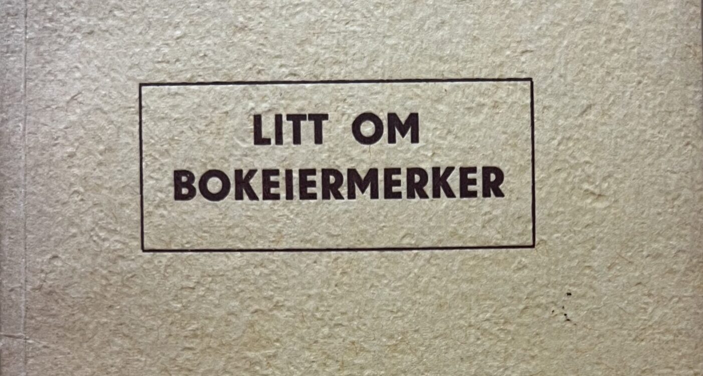
Only a year after the article in Morgenposten, the text was reprinted in a limited print run of 100 copies at O. Christensens boktrykkeri in Oslo. Digitised by the national library (which replaced the original paper cover with a marbled hardcover), the tiny octavo brochure is a rarity. It was not part of Nysted Heier’s collection when I bought it, and I supplied it to the collection a few months ago. My copy is no. 82 (of 100).
Interestingly, the colophon has a handwritten correction to the printing run: initially, I believe, it said 50 copies, which was edited in black pen to 100. From the second reprint (see object 4c), we learn that the 1941 print run was intended for 50 sales copies, and – I suppose – several copies for distribution by other means. It could be that the decision was made after typesetting was completed to print more than 50 copies for distribution and numbering. We may assume that O. Christensens boktrykkeri produced 100 copies and numbered them, whether for sale or as giveaways.
The small brochure, 31 numbered pages, is printed on possibly hand-made paper with visible mesh; however, no watermark. It is thread-bound. The colophon also enlightens the reader that the typeset and the clichés were borrowed by O. Christiansens boktrykkeri and printed from the original newspaper typeset. The layout, however, is significantly changed: the seven columns by three rows are spread across 14 pages in the brochure, with most of the exlibris reproductions at the end, one per page, each with a caption.
Who was the audience of this first reprint? Collectors? Exlibris owners? Høgdahl’s circle of colleagues, friends, and acquaintances in the advertisement and printing milieu of Oslo? I am not sure yet.
Object 4b
The special print of Høgdahl’s article from 1941 (taken directly from the typeset and clichés used for the newspaper print).
Special reprint of the illustrated newspaper article in Morgenposten from December 28th, 1940, using the same typeset and clichés.
Photo of the copy (no. 82, limited print run) in the collection of Annika Rockenberger (bought as an addition to the Nysted Heier collection).
The Norwegian National Library holds a fully digitised copy: https://urn.nb.no/URN:NBN:no-nb_digibok_2014111308003. Their copy is no. 91.
Reprinted Again – Why and For Whom?
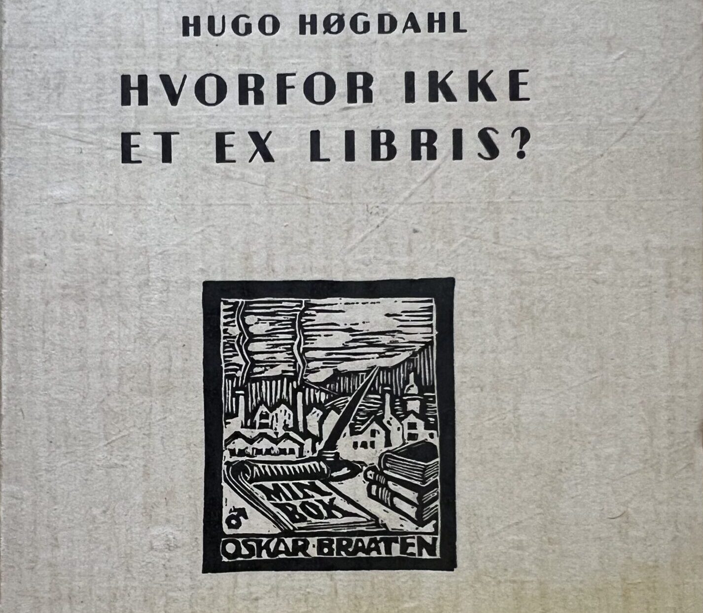
Object 4c
The second, 1942 reprint of Høgdahl’s original newspaper article, with edits to the text, a different title and a new exlibris on the cover.
The Norwegian National Library holds a copy of the special print (digitised) https://urn.nb.no/URN:NBN:no-nb_digibok_2014071508023. This is an edited reprint of the 1941 special print. It informs us about the previous special print (1941), which was printed in 100 copies, of which 50 were for sale.
The image above is a detail from the copy from the collection of Nysted Heier, now in my collection. Handwritten in pencil in the upper left corner is most likely the second-hand market price of the brochure, 3.36 [Norwegian kroner?]. I suppose it indicates that Nysted Heier bought this special print at a later point in time and not when it was first published. There are a few items in the Nysted Heier collection that have pencil-written prices in the upper left corner of the book cover.
The cover of this print features a woodcut exlibris for the author Oskar Braaten, by exlibris artist and book illustrator Albert Jærn.
It is only one year after the publication of the brochure Litt om bokeiermerker that O. Christiansens boktrykkeri reprints Høgdahl’s text again. On the same number of pages and with the same sequence of exlibris, several changes have been made.
Firstly, all captions are now set in regular type, not in italics, as was the case both for the Morgenposten newspaper article and the 1941 special print.
Secondly, almost all captions are expanded – one could say, they have been changed from mere captions into running text. As an example, the exlibris for Johan and Alma Fahlstrøm (page 21) now reads:
Det er kanskje ikke helt riktig å kalle Johan og Alma Fahlstrøms bokeiermerke for ‘portrett’-ex libris; men det ligger iallfall nær op til disse. Det er utført i kobbertrykk, 165 × 128 mm.
[It is perhaps not quite right to call Johan and Alma Fahlstrøm’s bookplate a ‘portrait’ exlibris; however, it is, anyway, close to these. It is made in copperplate, 165 × 128 mm.]
In the 1940 newspaper article, this is where the text is cut off. In the 1941 special print, the text following the image – in regular type, i.e. not marked as a caption but as part of the running text – says:
Johan og Alma Fahlstrøms, som er utført i kobbertrykk, er 165 × 128 mm, Mussolinis 200 × 155 mm., selve billedflaten noe mindre (Se side 29). Hvis man ikke selv er en høiviktig person, bør formatet på et ex libris holdes innenfor en beskjeden ramme.
[Johan and Alma Fahlstrøm’s, which is made in copperplate, measures 165 × 128 mm, Mussolini’s 200 × 155 mm., with the image a little smaller than the paper. (See page 29). If one isn’t an important person oneself, the format of the exlibris ought to be kept modest.]
The 1942 print omits the sentence about the exlibris size being related to the owner’s status. So, has Høgdahl removed the status marker because it does not reflect the reality of exlibris making in Norway, or because he does not want to imply to the audience of this second reprint that choosing a larger-format exlibris is, or might be, interpreted as presumptuous?
The immediate reference to the larger-size exlibris for Benito Mussolini, the leader of fascist Italy since 1928, is also omitted from the text surrounding Johan and Alma Fahlstrøm’s exlibris. Instead, the Mussolini exlibris on page 29 has an extended, descriptive text:
Benito Mussolinis portrett-ex libris utført i kobbertrykk. Størrelse: 200 × 155 mm.
[Benito Mussolini’s portrait exlibris in copperplate. Size: 200 × 155 mm.]
In the 1941 special print, the caption (in italics) only states “Benito Mussolini’s portrett-ex libris. While the newspaper article captions the image with:
Slik har Mussolini merket sine bøker. Han har brukt samme kunstner som Bernard Shaw.
[This is how Mussolini marked his books. He used the same artist as Bernard Shaw.]
In neither the newspaper article nor the 1941 special print, the artist of the Mussolini (and the Bernard Shaw) exlibris is named. This, however, is the case in the 1942 edition, where it says below the picture of the Bernard Shaw exlibris: “Den italienske kunstner Michel Fingensteens bokeiermerke for Bernard Shaw.” [“The Italian artist Michel Fingensteen’s bookplate for Bernard Shaw.”]. That Fingensteen is also the artist of Mussolini’s exlibris is not mentioned at all. What are we to make of this? Have the events of the past two years led Høgdahl to lower the status of the Mussolini exlibris, which now neither mentions the artist nor carries the inference from exlibris size to status as it did in the previous print?
A Change in Tone
Another significant change has been made to Høgdahl’s text as compared to the 1940s article and the 1941 special print. The beginning of the 1942 text has gotten a new heading, which now says “La oss begynne med en liten historie” [“Let us begin with a little history”]. In 1941, the heading still reads “Sving op med en historie, sa Nymann,” [“Get it going with a story, said Nymann,”] clearly the beginning of a sentence which is continued after the comma in the running text: “for du kan da begripe at ikke noe levende menneske vil befatte sig med sånt som ex libris” [“because you can then understand that no living human wants to engage with such a thing as exlibris”]. – In the 1940s newspaper article, we have the playful typographical design which captures our eyes with the two large and bold font words “Hvorfor ikke”, starting a the sentence, and continuing the sentence in the line below, typographically marked as a section heading, but syntactically connected to the interrogative particle, with “sving op med en historie, sa Nymann,” which in turn continues the sentence in the running text “[.]for du kan da begripe at ikke noe levende menneske vil befatte seg med sånt som ex libris.”
I think that the initial prompt by a person called Nymann to ‘get the story going’ was omitted because it made no sense to the intended audience of the 1942 reprint. It was already out of context in the 1941 special print, and because the same typeset was used from the original newspaper article, omitting it would have meant resetting type, which was clearly not considered worthwhile. Who this ominous Nymann is, or if it is a person at all (and not a fictitious antagonist, the “new man”), I cannot say. This figure prompts the writer Høgdahl to start with a story because only then will he (the writer) understand that no living human wants to engage with something such as the exlibris.– I am at a bit of a loss here. It’s not how I would start a first-pager for a Saturday supplement in one of the largest newspapers in Norway…
Anyhow, the tone has changed and the swift and entertaining ‘Why not an exlibris?” article has been reshaped into a toned down version which doesn’t provide any new content for the collector, other than to get hold of a pivotal piece of Norwegian exlibrisiana which otherwise would be hard to get one’s hands on due to the ephemeral nature (and the lesser stability of the newspaper medium’s materiality through time) of the Morgenposten onepager. Again, we have two special prints made exclusively for a collector’s audience. This implies that there was an audience for exlibris literature, at least in Oslo and that it was large enough to warrant the printing of these two brochures on high-quality paper with many illustrations during a time of rationing and limited resources.
Or were these initiatives by the exlibris collector and connoisseur Høgdahl himself, who wanted to give the special prints to friends and acquaintances? I don’t know the answers to these questions yet, but they’re intriguing!
Coda – What is Not in My Collection
There are very few publications about Norwegian exlibris from 1937 to 1942, and none of them are in my collection or in the remains of the Nysted Heier collection I bought nearly two years ago. The Norske Exlibrisiana bibliography from 1975 lists an elusive special print of the Norsk boktrykk kalender from 1939, by Arne Arnesen. Still, no library seems to have it, nor is it findable in the Norwegian National Library’s digitised collection.
P.S. I found it! And so can you. The illustrated article is printed on pages 21-36 of Norsk boktrykk kalender from 1939. Read the full text via the Norwegian National Library https://urn.nb.no/URN:NBN:no-nb_digitidsskrift_2025031283012_001. It is always interesting to see how bad the search on nb.no is and how little intuitively one has to navigate in order to find the objects of desire. As a side note, the 1939 issue of the Norwegian book printing calendar is decorated by none other than Albert Jærn! A prolific exlibris artist, who by 1939 was said to have made 100 exlibris and published two portfolios, one in 1928 and one in 1937. I must get my hands on these!
Another interesting find, which is not in my collection and was not part of my talk, is the 1940 textbook by Trygve M. Davidsen, “Tegning og skissering for boktrykk”. Written in four parts with exercises and richly illustrated, there is a chapter on bookplates, “bokeiermerker”, in the last part. I have not studied the chapter yet, but suffice it to say that Tryggve M. Davidsen, or T.M.D., is an accomplished exlibris artist who will be featured again in this blog post series with an object.
- A good overview of Morgenposten in Norwegian is provided by Rune Ottosen: ‘Morgenposten’. In Store norske leksikon. Oslo, November 26th 2024. https://snl.no/Morgenposten. The English Wikipedia article on ‘Morgenposten’ ( https://en.wikipedia.org/wiki/Morgenposten) is rather rudimentary. For a more nuanced overview, check out the Norwegian anthology edited by Yngvar Holm: Sværta. Morgenposten – en gang Norges største avis. Orion, 1999. https://urn.nb.no/URN:NBN:no-nb_digibok_2008093000004. Readers with a Norwegian IP address (or a creative approach to geoblocking) can consult the book via the link to the digitised copy in the Norwegian National Library’s collection.
↩︎
2 Comments
Comments are closed.